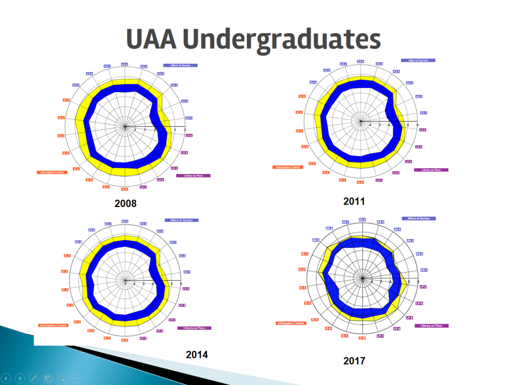
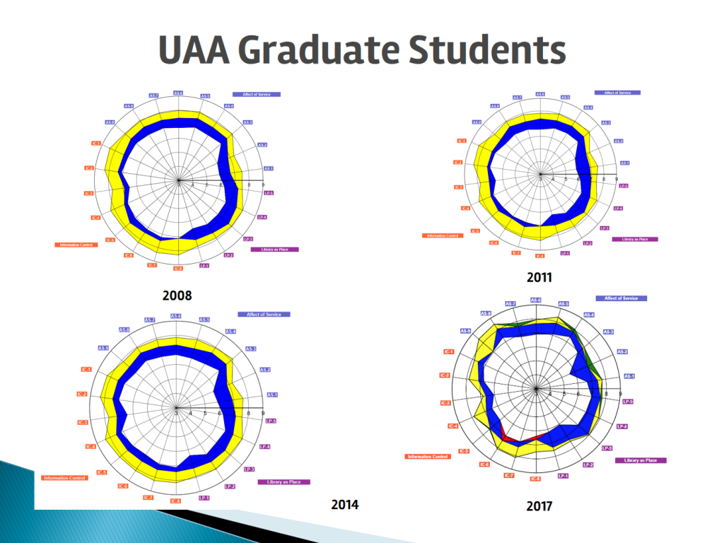
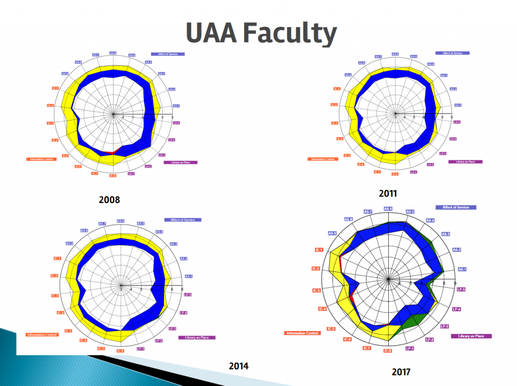
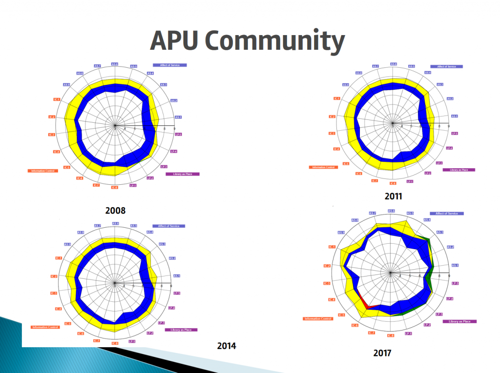
After conducting the LibQUAL+ Survey in November 2017, we have begun analyzing the results. For the most part, our users are satisfied with the services we provide and with our library building, but satisfaction with our resources is declining. This observation confirms our concern that budget reductions are causing our collection to suffer.
More details will be released in the weeks and months to come. For now, we would like to share a few slides that demonstrate our users’ changing perceptions over the past nine years.
These radar charts show the aggregate results for the core survey questions. Each axis represents one question. Please see the LibQUAL site for further explanation about reading these charts.
Essentially, Green is considered very favorable, blue is good, yellow is adequate, while red is unsatisfactory.


